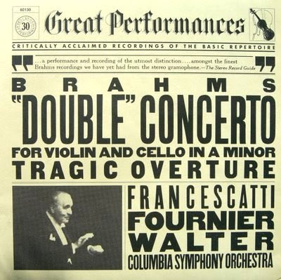
The art of typography

1981 LP sleeve of Brahms Double Concerto with Zino Francescatti and Pierre Fournier accompanied by Bruno Walter and the Columbia Symphony Orchestra. The striking cover is by Henrietta Condak who is listed as one of the notable women working in design 1900-1980. I don't believe the graphics ever transferred to the CD jewel box, and strangely the recording itself, which was made in 1960, doesn't seem to have fared too well in the CD catalogue. My copy of the CBS LP has beautifully silent Dutch pressings as opposed to the gritty surfaces of American CBS records of the period. More vinyl heaven here and more art of typography here.
Any copyrighted material on these pages is included as "fair use", for the purpose of study, review or critical analysis only, and will be removed at the request of copyright owner(s). Report broken links, missing images and errors to - overgrownpath at hotmail dot co dot uk


Comments
I have it on cd and it sounds great. I don't listen to the piece often, probably because the melodies are infectious and then I'm humming it for many days. But that's not such a bad problem to have.
All the tourist junk, posters, etc. from the cowboy culture I was hating at the time looked just like this!
"Desperadoes hanged at Noon", and all.
HOWEVER, Zino was a favorite, and despite my internal typography references and the gritty American pressing (yes, it's true!) I managed to enjoy the thing.
So interesting to "read" this cover again from another perspective - thanks!